Preview based browsing tool for permitting research
Product Design Fellow · 6 Designers
Overview
Infilla builds tools for city planning departments
Forum, their Q&A platform where zoning staff search through past discussions and expert reviewed answers instead of bringing up the same questions forever.
Infilla brought us in to add AI into Forum's search.
Zoning staff at permit counters answer applicants at appointments in real time, verifying it themselves. To zoning staff an AI's Interpretation isn't verification, so how could Forum still leverage the tool to make the process faster
Problem
Search in Forum failed in two different ways.
Keyword search breaking on small variants like hyphens, abbreviations, typos, meaning queries may return zero results despite an answer existing.
Search could also do the opposite and return pages and pages of previous posts which may be irrelevant to the query to begin with.
Additionally, the user base ranged from tech-forward planners to staff a few years to retirement and those resistant to AI, so how could serve them all with the same design?
Research
10 Planners told us to not build a chatbot
We looked at 11 products like LLM chatbots, social platforms, and civic tech platforms, to see how others tackled AI assisted research. Nearly all of the civic tech we observed had conversational AI chatbots that interpreted regulations or law in plain language. The tools that did the best allowed users to verify answers quickly.
We then also surveyed ten users of Infilla
8/10
wanted results that were fast and accurate with no trade off
6/10
found existing filters mostly unused due to low fluency or confidence in the feature
5/10
wanted to read official code themselves rather than accept an LLM's interpretation
10/10
expressed low to medium confidence in AI generated interpretations
While waiting for survey results, we explored chatbot concepts, which was our original thought process on what "adding AI" meant. When these results came in, it made these concepts irrelevant. To planners an AI chatbot's response meant another verification task.
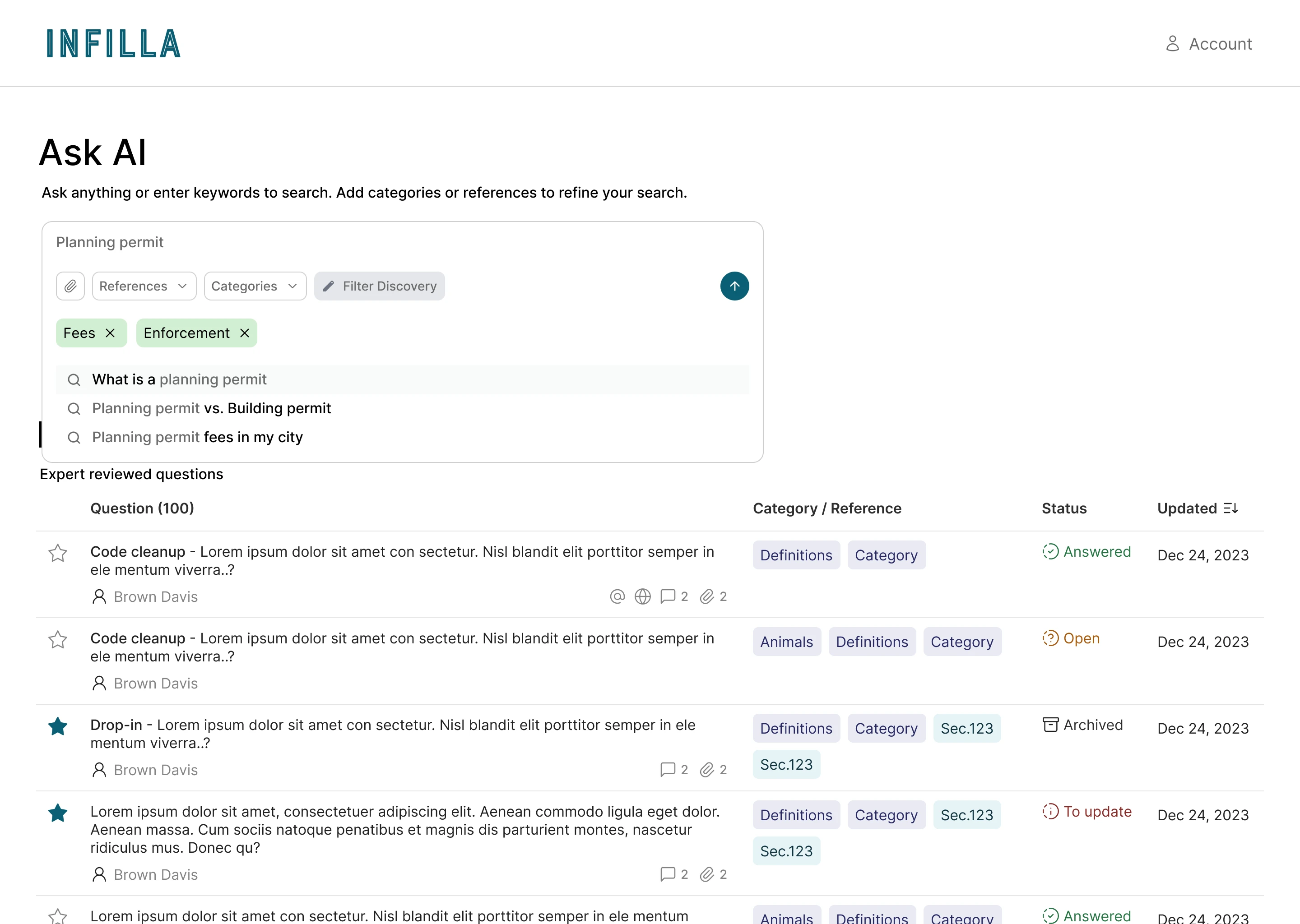
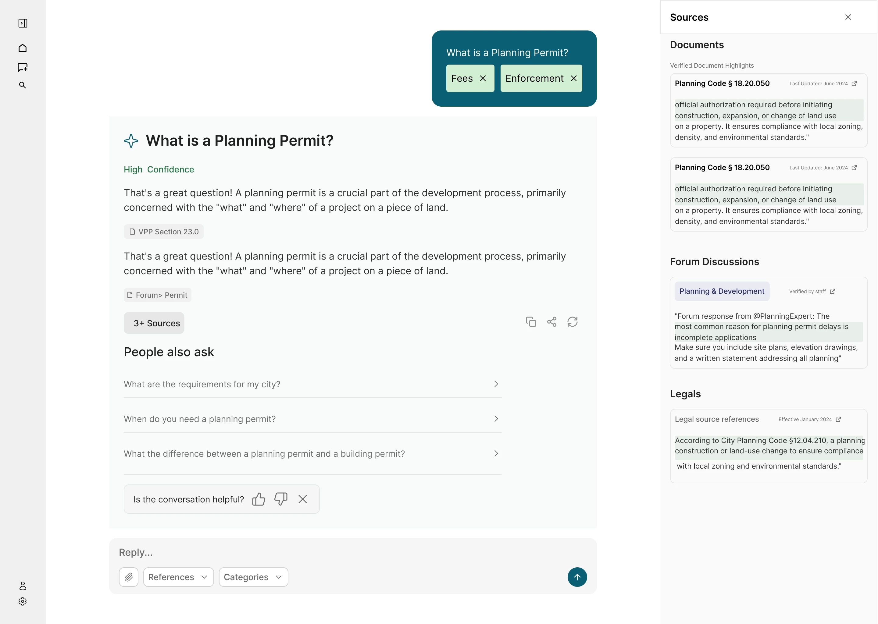
This meant AI's role in this project had to change to work behind the search and not in front of it, like catching variations, improved results surfacing and querying.
The best thing we did on this project was killing these early concepts.
Our learnings
Evidence > Interpretation
Search should always remain code and post first, not an generative
Traceability = Trust
From the evidence, point to who or where it was verified
AI supported navigation
Catching missed keywords, tags, and pointing to what is relevant while keeping judgement human
Mid Design
Backseating AI
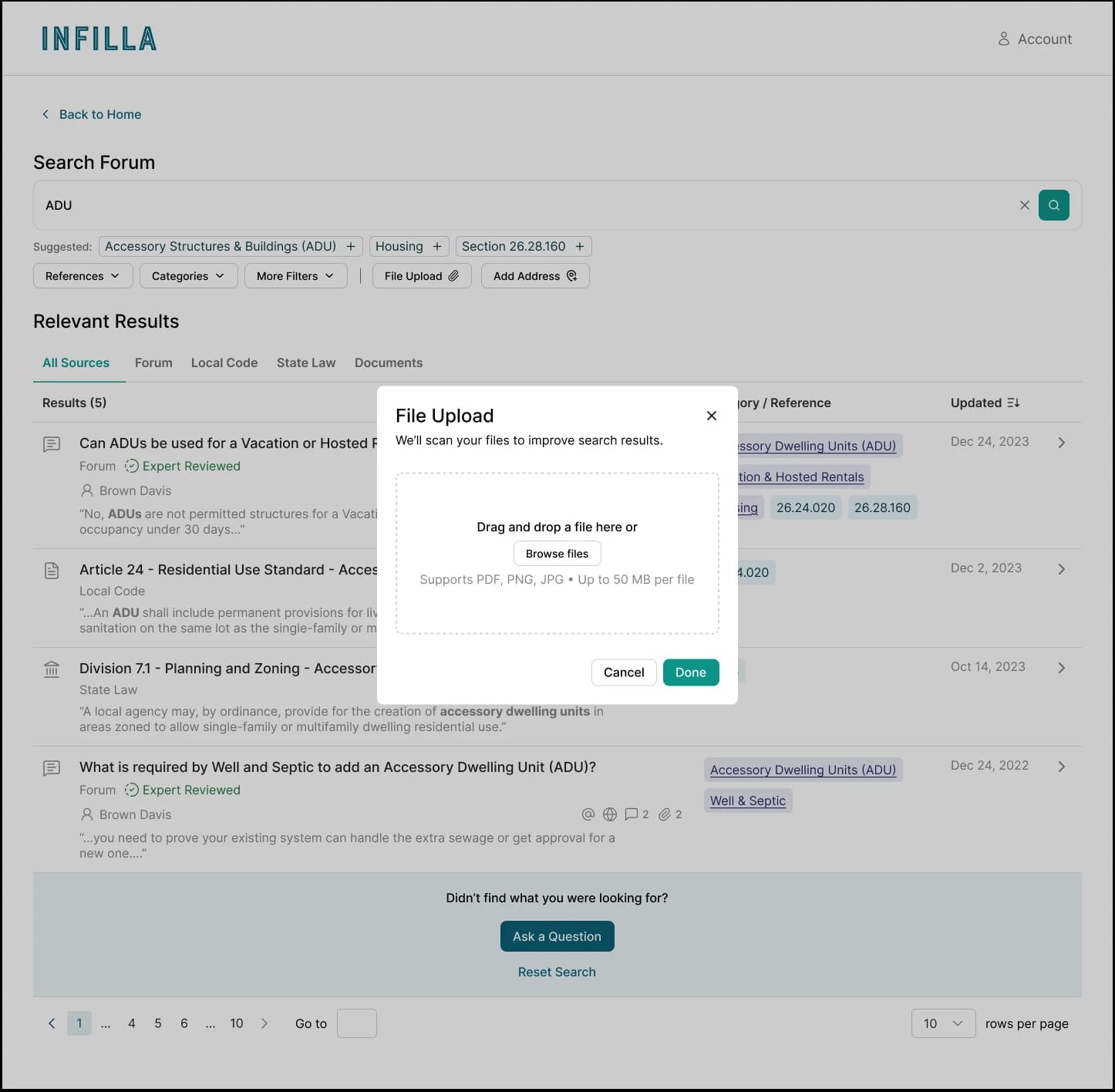
We added onto search with by guiding users with suggested filters, additionally added more space to bring context to the AI powering search with attachments and addresses.
Side Drawer
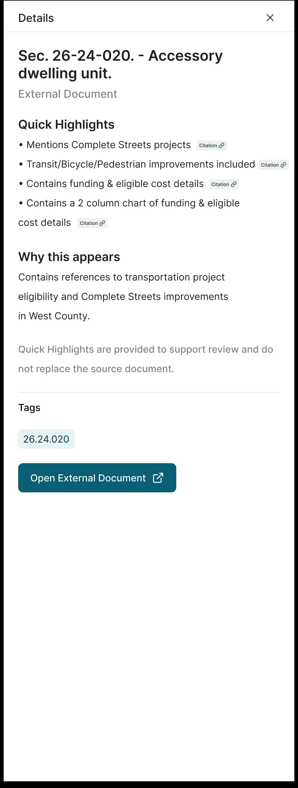
This is where I spent most of the project. In the old flow, questions were the only visible results with external documents living in a dropdown, which buried what users came looking for.
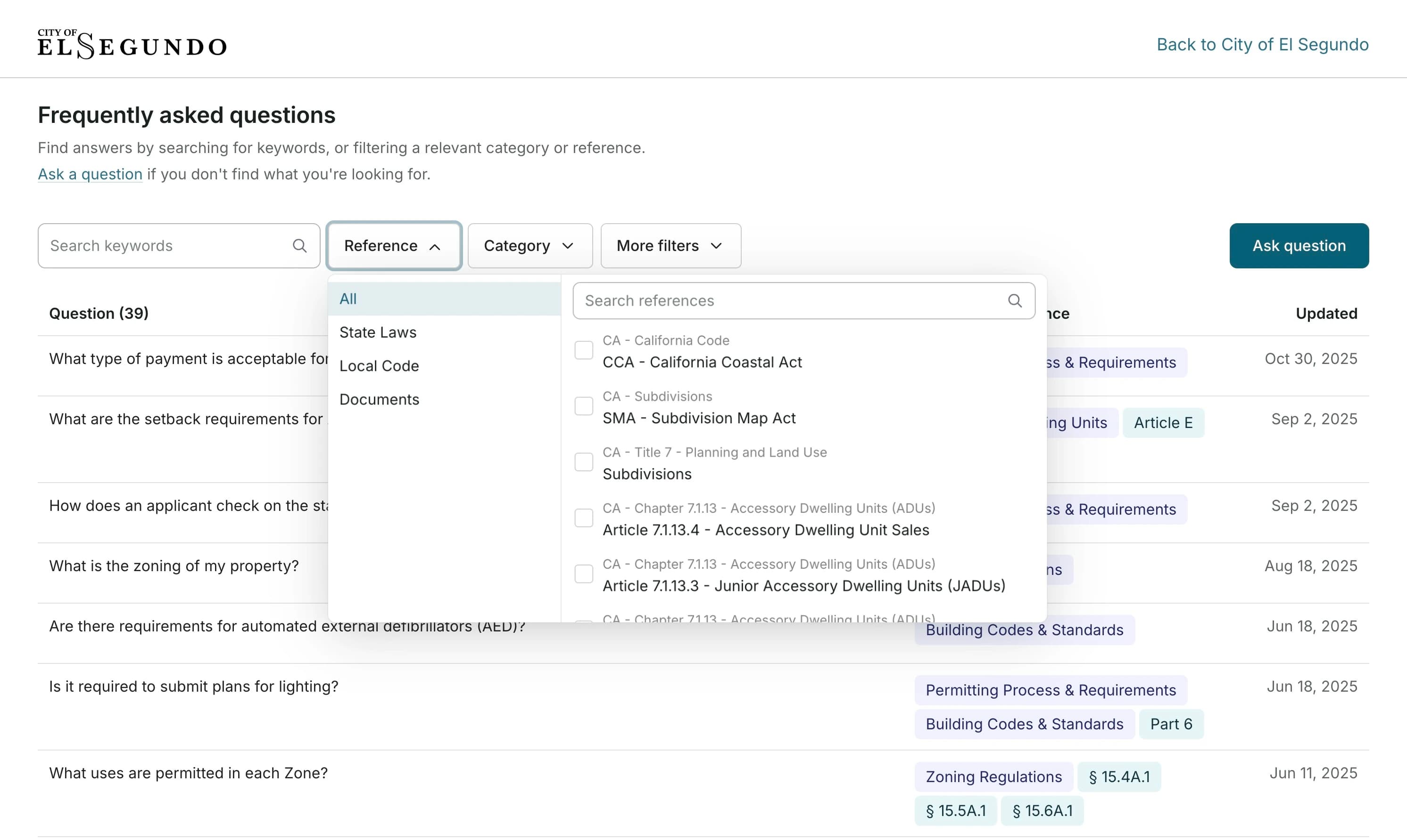
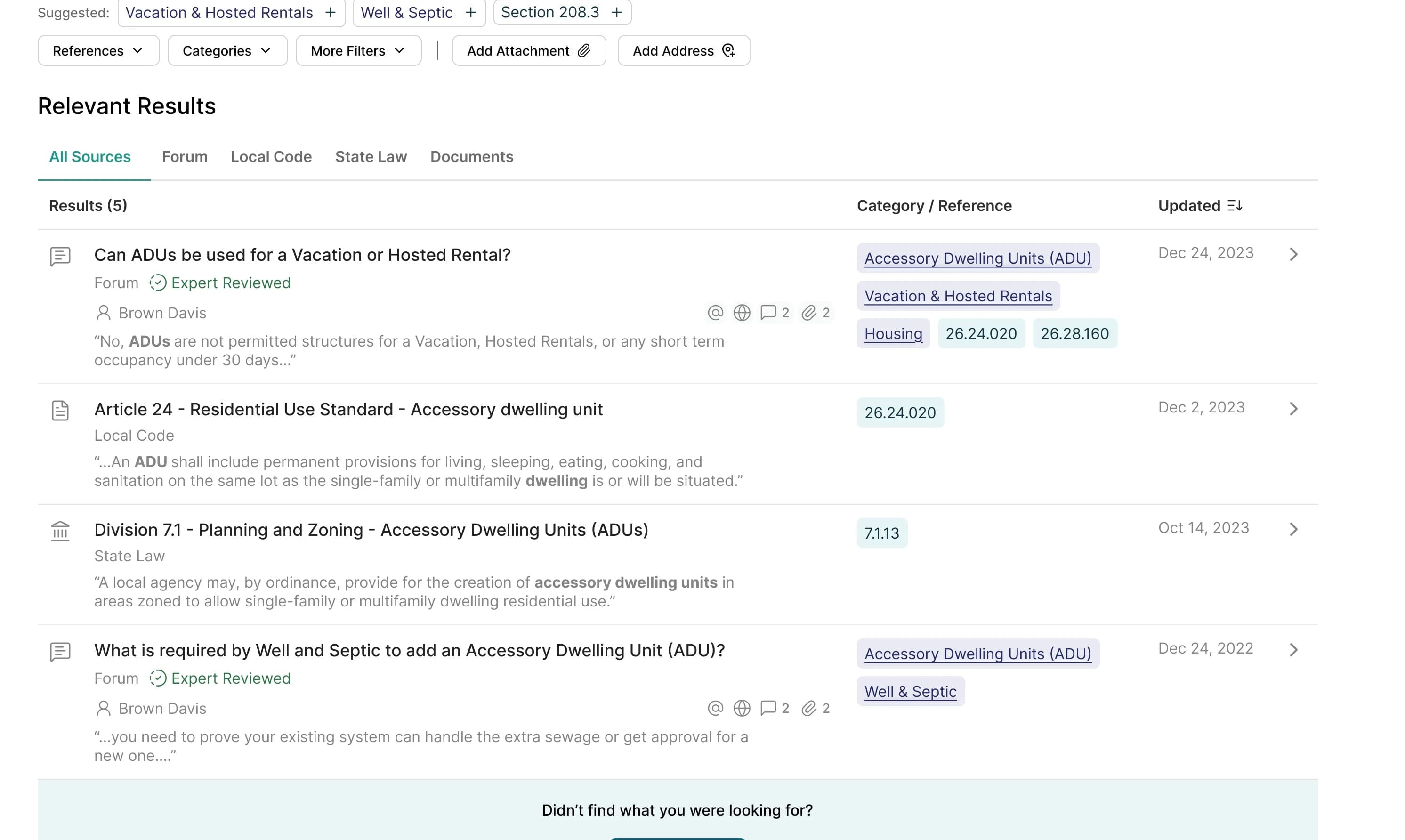
The first change was to surface these documents in results, and then to highlight the part of the source that is relevant to the query. From there selecting a result opens a side drawer with a path to open the full doc, which allows planners to not lose their place in search.
Prototype and Testing
Planners liked the drawer but said it was too much text
Them team then had thirty minute concept testing sessions with five planners for qualitative feedback. There side drawer got validation but overall, the design could use improvements
The side drawer was a wall of text
Planners liked the drawer but I was told it was a bit too much, so I reworked the drawers hierarchy by highlight text in the preview and visually separating metadata from content, making it easier to scan.
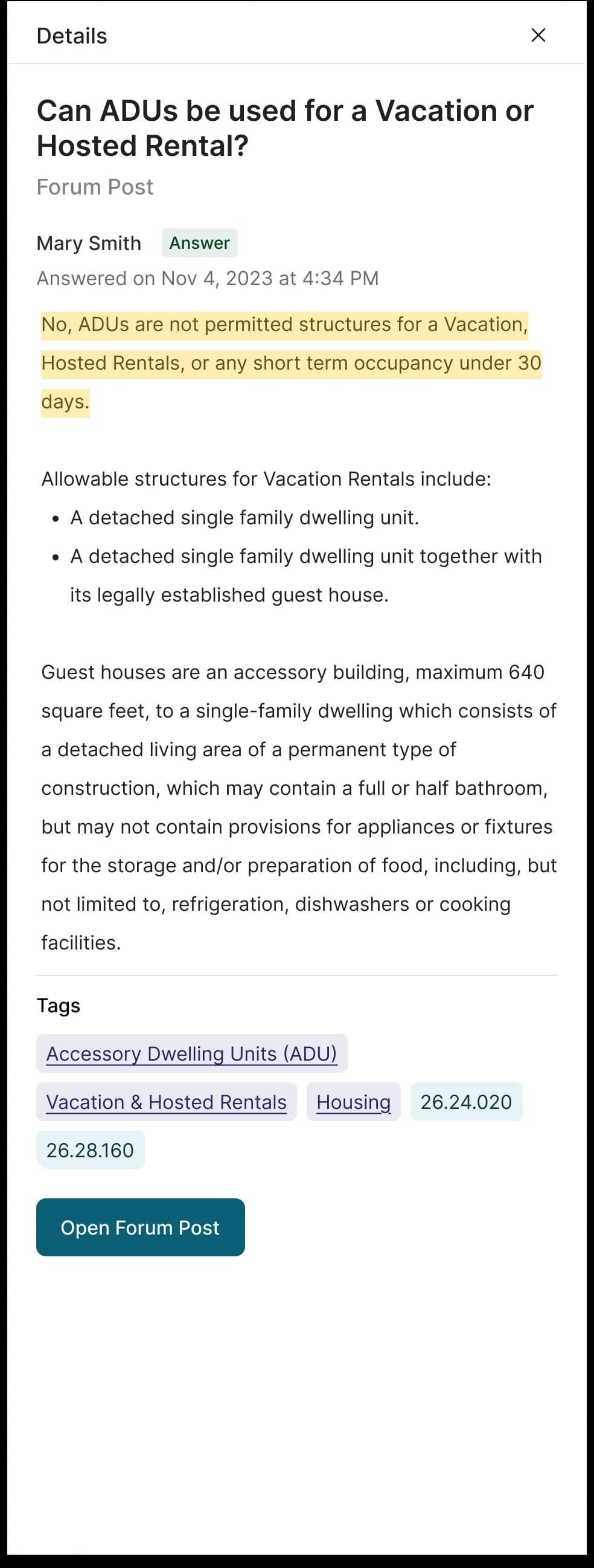
- 1
Who verified the answer and when — metadata sits apart from the content instead of blending into it
- 2
The verified answer is highlighted inside the preview, so the relevant lines surface without rewriting them
- 3
Tags trace the post back to its categories and code sections
- 4
A path to the full post — planners can go deeper without losing their place in search
Tooltips got ignored
The new filters either went unnoticed or confused people at first, to optimize for this we opted for a toast explanation for first time users.
Reflection
Where it ended
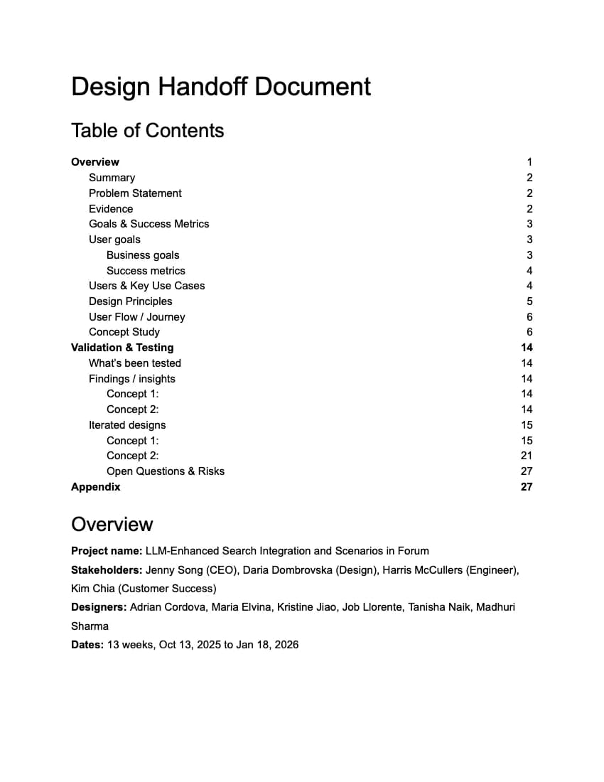
The program ended in parallel with a handoff doc of annotated Figma file and research doc that included flows, research, rationale, all for Infilla's team to build. Unfortunately I was not there for it to ship so there's no images or metrics to show here ;-;
What did stick with me was what trust means in user interface, our disconnect from what planners wanted at the beginning could have taken the project further in the wrong direction, consistent alignment is important and I won't make that mistake again.